|
|
|
display windows |
 The display windows in baudline are a collection of many different ways of
viewing sample data.
The display windows in baudline are a collection of many different ways of
viewing sample data.
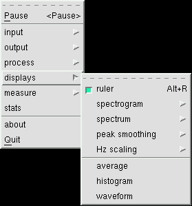
The display sub menu on the right is accessed by holding down the third mouse
button in either the spectrogram or the spectrum window and choosing the
displays item. From this menu you can configure the main spectral
windows, or you can open an entirely different view into the data.
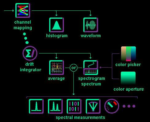
Time-domain views are sourced directly from
channel mapping
while the frequency-domain views pass from the
drift integrator.
All of the views display real-time data and are zoomable, while some of
them display instantaneous slices; others have scrollable time histories,
and some can even copy and paste signal data.
Baudline can display signal data in the following displays:
The average or the spectrum windows can be the source of many of the
measurement windows.
The diagram below illustrates the display signal flow.
|
|
|
|
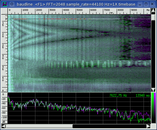
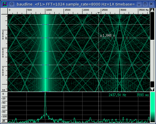
main window |
 This is baudline's main window which happens to be in the pause mode. It
consists of the spectrogram and the spectrum sections, both of which are
described below. While in the pause or play modes the timebase scroll bar
and the color ramps are displayed. While in record mode, data is being
collected and processed real-time, so the timebase scrollbar and the color
ramps disappear.
This is baudline's main window which happens to be in the pause mode. It
consists of the spectrogram and the spectrum sections, both of which are
described below. While in the pause or play modes the timebase scroll bar
and the color ramps are displayed. While in record mode, data is being
collected and processed real-time, so the timebase scrollbar and the color
ramps disappear.
title bar
The title bar on the top contains
some useful information such as F# bank selected and status, the FFT size,
the sample rate, and the frequency and timebase zoom factors. Also the
file name, if any, will be shown here. Depending on the window width,
some or all of these are displayed in the title area.
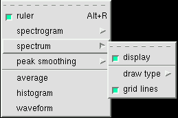
rulers
A common theme in all of baudline's displays is the ruler; it wraps around the
top and left axes of all display windows, it has pointer arrows that follow
the cursor, tick marks, numerical position, and label units that also convey
scale.
spectrogram
The top section of the main window is the
spectrogram area, and in this example it is just
one column of stereo data that is purple and green overlaid and blended
together. Up to 3 columns with 3 overlays
(RGB) equals a maximum of 9 positions that can
be displayed. See input
channel mapping
for configuration information.
spectrum
The view on the bottom of the main window is the
spectrum display. The
peak smoothing option is also part of the
spectrum display.
selector cursor bar
spectrogram display (white horizontal line) defines and tracks a slice of
signal that is displayed in the spectrum display.
frequency scroll bar
Moving the frequency scroll bar
at the bottom of the display will move both the spectrogram and the spectrum
sections. They are locked together in the frequency dimension.
When the window gets wide enough the frequency scroll bar disappears.
Hz scaling can also be done on the frequency axis if the window is narrow
or if a large FFT size has been selected. The minimum zoom factor is
1X which gives the most detail; it also happens to be the default value.
Zooming out gives a birds eye view which is useful when doing "weak signal"
work with very large FFT's. See Hz scaling.
window management
Note that the main window can be resized or iconified and the spectrum window
can be enlarged or shrunk by dragging the pane bar (the gray horizontal line
that separates the spectrogram and the spectrum displays). These settings
and window dimensions, like most settings in baudline, are remembered so that
the next time baudline is run, everything is set up the same way it was
at last exit (see the session management
section for more details).
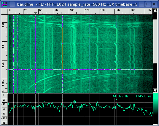
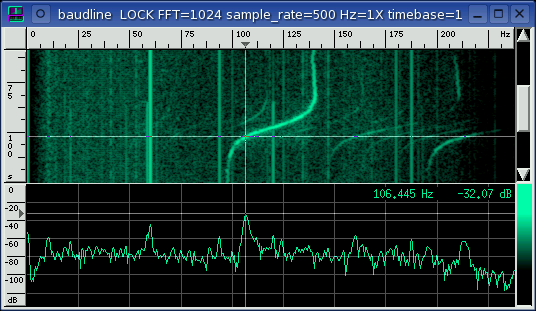
harmonic helper bars
In the screenshot above the vertical lines are the harmonic helper bars. When
the second mouse button is held down in either the spectrogram or spectrum
window the harmonic helper bars appear. They track any mouse movement and
when the second mouse button is released they disappear. The purpose of
the harmonic helper bars is to be a quick and simple means of determining which
harmonic content is related and what exactly is the frequency of the
fundamental.
Sometimes the harmonic content of a signal is straightforward and all the
details can easily be "eye-balled" with the mouse and the Hz display.
Other times the harmonic content is rich and complicated like in the above
example. Traditionally, in the past, a scientist would write down all the
frequency peaks and then use a calculator or spreadsheet to determine the
harmonic ratios. Such a procedure was always a royal pain and it never
really worked as well as it should have.
So SigBlips.com invented the harmonic helpers.
A vertical line is drawn at the frequency the mouse is pointing to,
44 Hz in the above example. This is called the baseline frequency.
To the right, vertical lines are drawn at 2X, 3X, 4X, 5X, ... of the baseline
frequency which represent the 2nd, 3rd, 4th, 5th, ... harmonics. To the
left, vertical lines are drawn at fractions of the baseline frequency f/2, f/3,
f/4, f/5 ... This is a form of error detection; if the baseline
frequency is itself a higher order harmonic of some lower fundamental you
will quickly see the relationships here.
Here is how to use them:
- Press and hold the 2nd mouse button down which will pop up the harmonic
helper bars.
- Move the mouse around in the spectro windows and the fundamental
frequency will change which will move all of the harmonic bars. See if
the harmonic bars visually line up with the signals in your spectrogram
display.
- Hit the left or right arrow keys and/or turn the mouse scroll wheel to
perform fine tune adjusting of the fundamental frequency. Sub-pixel /
inner-bin accuracy can be achieved this way.
- Release the 2nd mouse button and the harmonic helper bars will
disappear. Or press the Shift key and the harmonic bars will transform
into the periodic bars.
The harmonic helpers are very handy
for pulling fundamentals out of complex harmonic rich environments.
Here are some cases that the harmonic helpers make fundamental finding
easier:
- even, odd harmonics
- phantom fundamental
- multiple phantom fundamentals (the above picture)
- harmonic series that progress by prime, Fibonacci, or exponential sequences
Note that the harmonic helpers are also displayed and tracked in the
Average window if it is open. The
value of the fundamental frequency with fine tuning adjustments is displayed
in the delta selected window.
periodic helper bars
In the screenshot above, the horizontal lines are the periodic helper
bars. They are useful for determining the exactness of any repeating or
periodic behavior. They can be used for making precise delta timing
measurements. They can also be used to create a sort of user adjustable
grid for the time domain. Here are the steps on how to use them:
- Press and hold the 2nd mouse button which will pop up the
harmonic helper bars.
- Move the mouse in the spectrogram display and align the time domain slice
cursor to a point of interest.
- Press and release the Shift key. This will flip the orientation of
the harmonic helper bars by 90 degrees transforming them into the periodicity
helper bars. This action will also anchor the initial position (0 ms).
- Move the mouse and the periodicity bars will appear and move
appropriately. The spacing of the entire grid changes. Rough
measurements can be made quickly.
- Hit the up or down arrow keys and/or turn the mouse scroll wheel to
perform fine tune adjusting of the delta periodicity. Sub slice
resolution can be achieved this way.
- Release the 2nd mouse button to make the lines disappear. Or press
the Shift key to toggle back to the harmonic helper bar behavior (goto step
1). Move the mouse, adjust the time anchor point, and hit Shift
again. ....
The periodicity bars are also automatically mirrored in the
Waveform window if it is open.
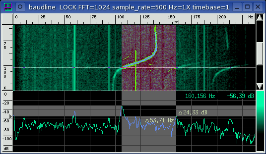
delta measurement bars
Measure the Hz between peaks or the dB from the top of a peak to the noise
floor. Perform accurate delta Hz and dB measurements by using the click,
hold, shift, drag, and release sequence. Here are the steps:
- Click and hold the 1st mouse button in the spectrum window
and the crosshairs will appear (see the illustration below).
- Move the mouse until the crosshairs are positioned to your measurement
starting location.
- Press the Shift key and drag the mouse. The delta measurement box
will appear and the delta text will display the frequency and dB difference
from the starting point to the end point. Accurate measurements can be
made this way.
- Release the 1st mouse button to make the measurement box and text
disappear.
The delta selected and the
frequency range display higher
precision delta measurement values for future reference. See the
illustration below for a graphical example of the click, hold, shift, drag,
and release operation.
click and hold

shift and drag
|
|
|
|
spectrogram |
 The spectrogram display is a flat three dimensional plot that is composed of
spectrum slices. The axis are time vs. frequency vs. color (spectral
energy). It is a very useful display for watching how frequency is
changing with respect to time. Fine adjustments to the spectrogram color
palette can be accomplished with the
Color Picker and the
Color Aperture windows. To
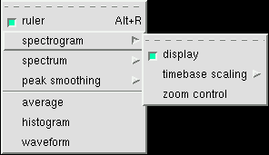
the right is the popup menu for all of the spectrogram controls. The
display can be enabled or disabled. The zoom control option pops up the
zoom control window.
The spectrogram display is a flat three dimensional plot that is composed of
spectrum slices. The axis are time vs. frequency vs. color (spectral
energy). It is a very useful display for watching how frequency is
changing with respect to time. Fine adjustments to the spectrogram color
palette can be accomplished with the
Color Picker and the
Color Aperture windows. To
the right is the popup menu for all of the spectrogram controls. The
display can be enabled or disabled. The zoom control option pops up the
zoom control window.
timebase scaling
With the menu shown above the vertical timebase scaling can be zoomed in or
out. You may find tearing off this menu or using the Alt+arrow shortcuts
faster and more convenient. See the
keyboard reference tables
for all of the hotkey shortcuts.
ruler
The horizontal axis on the top ruler is frequency in cycles per second
(Hz). The vertical axis on the left ruler is time in milliseconds (ms);
note that depending on the zoom level the units can switch to seconds (s).
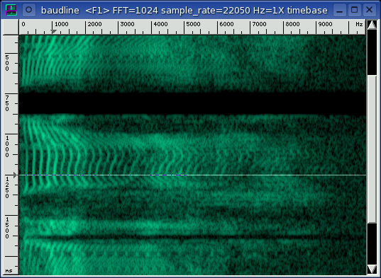
spectrogram
The green middle section is the spectrogram which is made up of
spectrum slices that have the dB values translated into color gradients.
The brighter the green the stronger the peak. Both the term sonogram and
spectrogram are used interchangeably in DSP literature. Both terms are
correct.
scrollbar
On the right is the time history scroll bar. Note that the mouse scroll
wheel is attached to this scrollbar. Also the home, end, page up, page
down, and arrow keys can be used to navigate the time axis. See the
keyboard reference tables for all of
the hotkey shortcuts.
cursor bar
The white XOR'd line at 1250 ms is the cursor selector bar. It is the
slice of spectrum at which the mouse cursor is currently pointing. Other
windows such as spectrum and waveform have their displays locked to whatever
position this cursor is at. The selector bar can be click and dragged to
select a region of signal data. Whether you use the scroll bar, keyboard short
cuts, or the mouse wheel, scanning large amounts of spectral data is quick and
easy with this smooth scrolling window.
delta duration measurements
When a region of data is being selected by the cursor bar, the
delta measurement which is the duration appears as a heads up display next to
the mouse pointer. When the mouse button is released the selection
remains but the delta duration text disappears. The delta duration is
simply the absolute value of the difference of the start position from
the end selection position. In the above picture a duration of 4.819
seconds is selected.
|
|
|
|
spectrum |
 The spectrum display is the current
slice of frequency data that the cursor is pointing to in the spectrogram
window. To the right is the popup menu for all of the spectrum controls.
The spectrum display can be enabled or disabled. The spectrogram pictured
above was taken with this spectrum display option disabled, while the picture
of the spectrum display below was taken with the spectrogram display
disabled. Also the light gray grid lines can be enabled or disabled.
The spectrum display is the current
slice of frequency data that the cursor is pointing to in the spectrogram
window. To the right is the popup menu for all of the spectrum controls.
The spectrum display can be enabled or disabled. The spectrogram pictured
above was taken with this spectrum display option disabled, while the picture
of the spectrum display below was taken with the spectrogram display
disabled. Also the light gray grid lines can be enabled or disabled.

draw type
The drawing type can be changed to lines, points, or
bars. On slow, non accelerated video cards, drawing the spectrum with
points will be faster but it won't look as clear or bright.
The bars option is currently not implemented.
ruler
The horizontal axis on the top ruler is frequency. Since
this axis is shared with the spectrogram window, the units and the scale
are the same. The vertical axis on the left ruler is spectral energy in
decibels (dB). At the top is the 0 dB
reference point which is defined to be the loudest level possible from the
input source (16 bits). At the bottom of the ruler is -136 dB, which
means 136 dB beneath the 0 dB reference signal. You may be asking
yourself how can a 16 bit linear waveform, which has a 6 * 16 = 96 dB of
dynamic range, have spectral energy with a
signal to noise ratio (SNR) of 136 dB? For the answer click this
link into the FAQ.
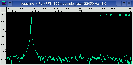
spectrum
The frequency spectrum for each channel is plotted Hz vs dB. When in the
record or play mode the real-time stream is plotted here. When in
the pause mode the slice defined by the cursor selector bar in the spectrogram
is plotted. Multiple channels per column position are drawn with
different color overlays. And multiple columns of spectrum are stacked
next to each other horizontally.
color ramp
The green gradient color ramp on the right of the spectrum window shows the dB
to color mapping that is used in the spectrogram window. The color ramps
are chosen automatically so as not to conflict and they can be manually
selected in the input
channel mapping window.
OSD
The on screen display (OSD) in the upper right
corner of the spectrum window displays the frequency, dB, or time position that
the mouse is currently pointing at. This is useful for pinpointing
measurements.
|
|
|
|
peak smoothing |
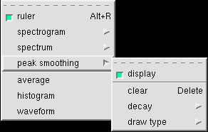 Peak smoothing takes the spectrum and performs either a
peak hold and manual release or a peak hold and decay operation. Here
is the popup menu for all of the peak smoothing controls. The display
can be enabled or disabled. The draw type can be selected just like
it can be in the spectrum window.
Peak smoothing takes the spectrum and performs either a
peak hold and manual release or a peak hold and decay operation. Here
is the popup menu for all of the peak smoothing controls. The display
can be enabled or disabled. The draw type can be selected just like
it can be in the spectrum window.
clear
Manually clicking the clear option or hitting the Delete keyboard
button will reset the peak curve to zero. This is of particular interest
when peak hold is selected in the decay menu.
 decay
decay
This is the rate in dB per second that each frequency bin decays. The
decay rate is divided by the spectrum display's frame rate (FPS), and that is
the amount that each peak bin decays.
The peak hold option displays the largest peak until it is reset with
the manual clear command. A smaller decay rate makes the peak
smoothing curve react more slowly to signal changes while the max 4096 dB/sec
rate is very close to the raw spectrum's snappiness.
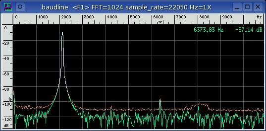
This is the spectrum window - same rulers, color ramp, and OSD. The
orange peak smoothing spectrum is new. Notice how the orange curve
traces out the motion of the moving spectral peaks.
|
|
|
|
Hz scaling |
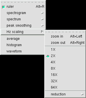 This is used to zoom the Hz axis in or out with a zoom factor from 1X to
64X. The minimum zoom factor is 1X which gives the most detail; it also
happens to be the default value. Zooming out gives a birds eye
view. This type of zooming on the Hz axis is also know as reduction
scaling.
This is used to zoom the Hz axis in or out with a zoom factor from 1X to
64X. The minimum zoom factor is 1X which gives the most detail; it also
happens to be the default value. Zooming out gives a birds eye
view. This type of zooming on the Hz axis is also know as reduction
scaling.
The spectrogram and the spectrum windows share the same frequency axis.
They are coupled and the Hz scaling parameter controls both windows.
Not all zoom X factors will be available at all times. Availability is a
function of transform size and the window width. For higher zoom X
factors the FFT size needs to be increased and/or the main window width needs
to be decreased. For the baudline default case of maximum window
width and the 2048 point FFT size only the 1X zoom factor is available.
Hz scaling can be control from the menu, the keyboard, or the mouse
wheel. Zoom the frequency axis in or out by pressing the Alt+Left and
the Alt+Right keys. Holding the Shift key while turning the mouse scroll
wheel will also change the Hz scaling.
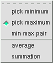 reduction
When the Hz scaling zoom factor is equal to or greater than 2X then the
amount of transform bins need to be reduced. For example if the Hz
scaling is 4X then 4 transform bins need to be reduced down to 1 bin. The
reduction algorithm controls how the bin scaling is performed.
The default option is pick maximum which would choose the largest of
the 4 bins for the 4X example. The pick minimum option would
choose the smallest of the 4 bins. The average option adds the 4
bins together and then divides by 4 while the summation option only
adds them. The min max pair option performs both the
pick maximum and the pick minimum algorithms at the same time
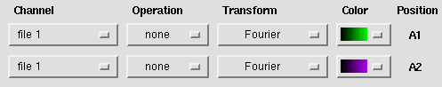
but requires some extra manual configuration. In order to visualize the
min max pairs the input
channel mapping needs to
be configured to add a second channel that is is a duplicate of the
first, see the example picture below:
Which reduction algorithm option is the best? It depends on your
application. The pick maximum option has more weak signal
extraction power than the average or summation options.
But the addition themed options are useful when comparative power measurements
are needed. The min max pair option is unique in that is shows
both the min and max choices at the same time but the configuration setup is
more complicated.
|
|
|
|
|